Make no mistake about it, these days it can be hard work getting website traffic.
Building out email and ad campaigns consists of planning, design, copywriting and lots of time!
With all the time involved, it can be frustrating to see campaign results of people who clicked through to your website, but that’s all they did!
So what’s a great way to get more leads from your ad and email campaigns?
Landing pages!
What is a Landing Page?
A landing page is a single page that is solely focused on capturing the attention (and contact info) of your target audience and getting them to complete your desired goal, for example, to download your free eBook or sign up for your webinar.
These are most commonly used in conjunction with an ad campaign for the visitors to “land on” once they click the ad.
While not always the case, landing pages typically lack navigation links or anything that could distract the user away from completing your desired goal.
What’s Wrong With My Home Page?
You’ve put a lot of work into making sure your home page speaks to your target audience and that’s great.
But, keep in mind that home pages are often scattered with a lot of information.
A typical home page can consist of a slider with multiple images, blog posts, a navigation bar, recent news, etc. Yes, lots of distractions!
It can be hard for your offer to compete with all of that.
The great thing about landing pages is that they’re simple and direct the attention of your target audience to complete your goal (like downloading your eBook).
Three Great Reasons to Use Landing Pages:
The single, best reason to use landing pages is that they increase conversions.
Whether you’re looking for more sales, attendees, or to lead people down your sales funnel, targeted landing pages have a single purpose–lead generation.
According to Wishpond, single offer landing pages can increase conversions by 266%.
Landing pages help to ensure consistent messaging.
Since landing pages are most often used with ad or email campaigns, you want to direct people to exactly where they can find the offer or message you’re advertising.
For example, if you want people to sign up for your webinar, you want to make sure you point them directly to a landing page where they can easily sign up for the webinar.
On the contrary, pointing visitors to your home page where they have to search around to find the webinar sign up form is not a good idea.
Remember all the distractions that are present on your home page?
This type of inconsistency can lead to clicking the back button and you’re likely going to miss out on converting a lot of your visitors.
Instead, a focused landing page ensures that the visitor will see exactly what they found intriguing from your ad.
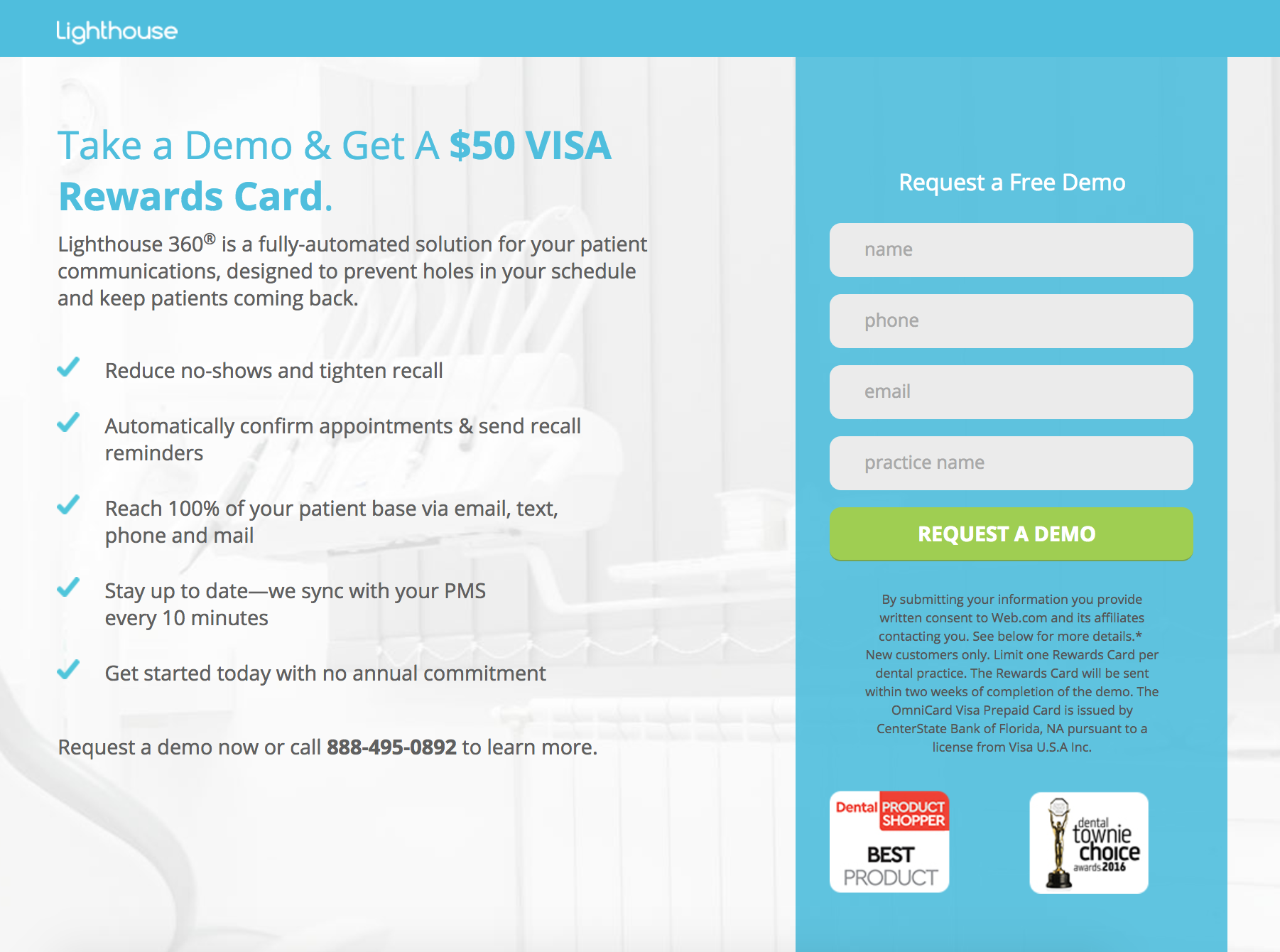
Here’s a good example of consistent messaging within a campaign using landing pages:

Once clicked, the user lands on the following landing page with consistent messaging:

Landing pages can be easily A/B tested.
Unlike testing different versions of your home page, it’s easy to test multiple versions of landing pages with different headlines and call-to-action messaging.
What’s more, landing page templates with proven, high conversions make it easy for you to plug in your information and hit publish.
Once you test to find out which one converts the best for your particular campaign and audiences, you can work to steadily increase your conversion rate.
The Final Say
If you haven’t yet tapped into the power of using landing pages to generate leads for your business, then now’s the time!
You can fall into the trap of trying to perfect your website and increase conversions (which of course is important in due time), but a simple landing page can often be just what you need.
Luckily, there are many online services available that make them simple to set up and use.
It just takes a bit of effort and a specific plan and purpose in mind.
So get out there and promote your webinars, events, or new coaching offers with landing pages!

